Biomedical Resource Discovery Portal Design
Center for Data to Health (CD2H)
Project Overview
Biomedical researchers devote a significant part of their workflow to using multiple search interfaces in order to navigate through vast amounts of fragmented and varied resources, such as journal articles, researcher profiles, and datasets.
The Center for Data to Health (CD2H) Resource Discovery Portal that I designed the interface for addresses this issue by aggregating the largest collection of biomedical resources in the United States into a single location where clinicians and research scientists can use a single, simple interface to explore the landscape of biomedical information.
My Role
I was responsible for user research, information architecture, usability testing, wireframing and prototyping. The project was led by back-end and systems architecture developers. Other members of the team included a front-end developer and schema developers.
I worked on this project for four months.
The problem
Since the Center for Data to Health (CD2H), the large grant funded project that the team was working as a part of was on the last year of it's five-year funding term, there was a strong desire from grant leadership to use the new design as a way to show the success of the project as a whole. Particularly, they wanted to be able to show off the scope of resources that the project has made available to researchers as well as the collaboration that it has fostered among the 50+ research institutes that have contributed to sharing resources.
Before the project started, a significant amount of back-end development work had already been completed to build the architecture for an existing product that allowed users to explore resources that had been gathered during CD2H's term. While this product that collated an enormous amount of data and other resources from a variety of sources was impressive from a technical perspective, it had significant issues with its UI and the team agreed that a new interface need to be designed from the ground up.
The team identified prioritizing UI design, and particularly usability, as a major focus, not only because of improvements that were need from the previous design, but also because it would allow us to stand out from other analogous services available. Users of biomedical resource discovery platforms told me during interviews that their ideal product would be a combination of the interfaces that they currently use, which include general tools like Google and specialized tools. The latter are often targeted towards expert users and are not optimized for usability. This is particularly an issue because of key differences that characterize the user population. These differences include:
-
intended uses - user activities range from general browsing to targeted searching for a particular resource
-
levels of institutional support - some users work by themselves as solo researchers, while others' roles are dedicated to searching for resources on behalf of a senior investigator or research team
-
technical expertise - some are very familiar with technical language and navigating complicated interfaces to find resources, while others, such as clinicians whose work is focused on direct patient care, are not
Design Process
In the kickoff meeting for the project, the team discussed work that need to be done and began a timeline. I proposed steps that could be taken to implement a UX design process and suggested project goals, both of which the team gave positive feedback to and approved. The project goals that I proposed were:
-
Improve the usability of targeted searching and browsing compared to the previous interface
-
Make the types of available resources highly discoverable
-
Communicate a clear and succinct narrative of CD2H accomplishments
-
Identify the needs of the range of users for the product and integrate these into the final design
During this meeting I also gathered information about potential connections that people on the team had that we could use to recruit for user research. I wanted to make sure that we gathered direct information from biomedical researchers. Using this information, I recruited five participants for interviews.
The interviews that I conducted lasted 45 minutes to an hour. They were semi-structured and focused on learning about the current ways they search for information, their pain points and their goals when doing their work (both narrow and broad). I also did a brief walkthrough of our existing product during each interview to gather their impressions. Once I completed these interviews, I transcribed them and identified major themes. I compiled this information along with links to the interview videos on a Figjam board with relevant quotes to go along with themes that I identified.

Interview Notes

Interviews Summary
In addition to interviews, I worked with another member of the development team to conduct a literature review. I focused on the information needs of bioinformatics professionals, while they focused on search interface usability.
To begin gathering inspiration for the new interface, I reviewed other bioinformatics resource discovery portals, as well as analogous commercial examples for a comparative review. I created a board with notes to share with the rest of the team that included screen shots of relevant sections of the interfaces. I evaluated each interface with notes for interesting features, navigation structures / elements, visual design elements, and potential applications for our interface.

Comparative Review Notes
I began creating the design for the interface by making low-fidelity mockups using InVision Freehand to start thinking about possible pages and content that we would want to include.

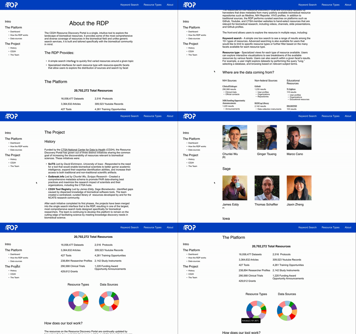
Home and About Pages
Improving the home and about pages for our interface was a priority based on my findings from user interviews. When asked for their initial impressions of the previous site's landing page, one of the participants said "my thought is, I don't know what these things do. Because I don't know what I don't know." Another participant said "I've only looked at this today so I haven’t really spent a lot of time here, but I'm a little lost. It seems like there are a lot of good tools here. I just don't know what they are."
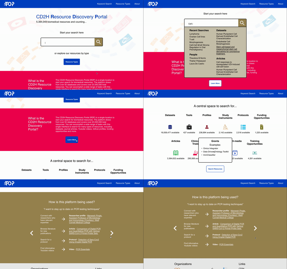
Beyond usability issues, there were consistent themes that I heard during the user interviews about what they like to see on landing pages for tools like this. One was that they liked to have a prominent search bar immediately visible. A couple of participants specifically referred to this as a "one stop search." Another theme was that they like to see specific examples of the data and use cases before they jump in.
Third, and perhaps most important, I learned during the user interviews that people didn't grasp what types of resources were available after viewing the then-current interface. I decided that making the variety and types of resources that are available obvious would be a high priority.
I made sure to apply these features when creating a wireframe and later a high-fidelity interactive prototype for the landing page.

Previous landing page

Home page wireframe

Home page above the fold

Full home page

About page
Information Architecture Development
When building this new interface, we brought in a significant amount of new data, which resulted in having over 15 different data sources, each with different metadata schemas. To help standardize this metadata, I manually went through example records from each of our sources and identified all metadata fields that might be relevant. I created a template to take notes for each metadata field (seen in blue sticky notes below), such as a proposed display name and where it might go on the website front-end. Additionally, I sorted the sources (red sticky notes) into proposed resource type categories (yellow sticky notes) that we would display on the front-end.
I created these to facilitate discussions with members of the development team that were responsible for the final metadata schema. As the project progressed, I continued to meet with this group to develop our schema for the platform.

Metadata notes
While working with the metadata for this project, I realized a potential opportunity that our uniquely large and varied data could provide: creating views at the level of institution or individual person that would display the resources from all of our disparate sources. When I proposed this idea to the team, they liked the idea and suggested that I mockup a layout for these views to further discussions with visuals. I created wireframes to communicate these ideas, which you can see below.


Institution and Person View Wireframes
The team had positive feedback for these interface ideas and initially was planning to implement them. In later discussions however, we realized that the metadata disambiguation process that would be required to implement these features would cause us to go beyond our development timeline. We decided to shelve these for future product updates.
Search Results and Resource Type Pages
Exploring the metadata for our portal helped me realize other opportunities and challenges that they afforded. A major benefit is the richness of the metadata from some of the sources, which could allow users to finely tune their searches. A drawback however, is that because they come from so many sources, it was very difficult to find metadata fields that could be used as filters that were common across all of the records, even within the same resource type. For example, even a simple type of information like date varied widely across the data - some would only have a creation data, some would only have a last updated date, and other would have many other dates.
My initial idea for how to deal with this problem would be to identify metadata fields that were common across most of the resources and display them on the filter column.
I created wireframes seen below that explored different ways that we could design the filter section using these metadata fields.
Additionally, I populated the actual results with real examples from the resource types to give the team a feel for what the metadata fields that I had suggested including for results would look like.

Search Results Wireframes
Creating these wireframes and discussing them with the team helped further my thinking about the interface. I decided that because it would be difficult to utilize the rich metadata for each of the different types of searches, we could create two distinct types of views: one being a simplified version of the search interface from the previous wireframes and another being resource type pages tailored to the facets and information specific to each resource.
I wanted to make sure that a cursory and more complex searching methods were available on this page because one of the themes from user interviews was a desire to be able to alternate between simple Google-like searching for quick searching and a more in-depth faceted searching experience in the same interface.
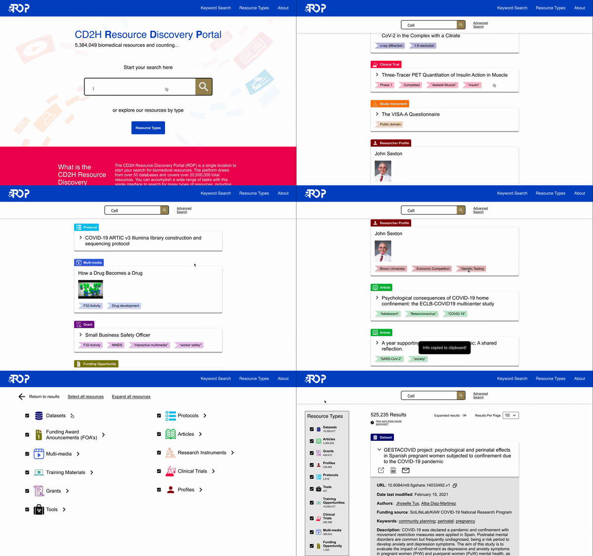
The simplified keyword search view is centered around cards that expand and collapse, with a column to select resource types. It also featured an advanced search search page that lets users dive deeply into facets that are specific to each resource type to tailor their search to their needs. I created advanced search filters that were unique for each of the resource types and had facets that were based on my examination of the metadata; I added this to help facilitate discussions with members of the team working on the metadata schema so that they could see my recommendations visually.

Previous Search Interface

Keyword Search Results Page
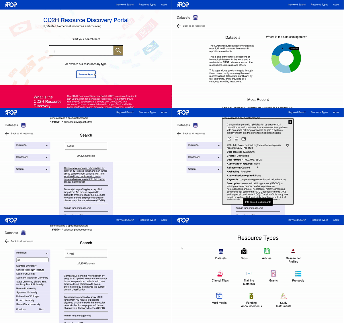
The resource type pages are designed for the use cases of researchers that are interested in a specific type of information and want to regularly return to see what is new as well or search in detail. They have facets specific to the data that is being shown so that users can both engage in targeted searching and browsing.
Each resource type has a consistent color schema and logo that is used across the keyword search page, the resource types pages, and the home page. This visual consistency is meant to help users keep track of the different resources types across the interface.

Resource Type Page
Usability Testing
After creating high-fidelity designs, I performed a round of usability tests using the interactive Figma prototypes. My script included tasks that encompassed each of the pages. I made sure to invite developers into the sessions to watch as observers and discuss takeaways after the session was complete.
I made several updates to the UI based on the feedback from these usability sessions and subsequent conversations with the larger development team.
-
Home page - I made the top hero section slightly shorter after seeing that some participants did not realize that there was content below the fold that they could scroll to.
-
Keyword search page - I pared down the amount of information that we would display for both the advanced search facets and the record details for several of the resource types after hearing from participants that the amount of information on these resource types was overwhelming.
-
Keyword search page - I also simplified the search bar. In the version that I had participants test, there were more complex interactions, where the search bar would expand in size on click and they would see the range of resource types of clickable buttons. I both heard and saw evidence that this was distracting and that the actions were unclear, so I made them more explicit by moving the resource types list to a column on the left side and removing the expansion animation.
-
Resource type page - This page was changed the most based on feedback. Participants were particularly confused by the initial design of the page. It had prominently featured an interactive element that both served as a data visualization and a navigation tool for exploring records. The participants found this tool unintuitive and felt overwhelmed by other information on the page, such as a large number of facets displayed individually. To fix this, I significantly simplified the searching experience with a single column of results and facet selectors on the side. The visualization element was pared down to a simple donut chart.
Results
This site is currently in active development. Key metrics that I plan to evaluate to judge the success of this design project are the numbers of new and returner users and the bounce rate from the landing page.
Even without these metrics however, there is evidence that the design work for this project has already had positive impacts. One of these is spreading knowledge of UX processes and methods. I helped introduce concepts like usability testing to members of the team who were not familiar with the method by inviting them into sessions. I also helped increase knowledge about the UI design process by regularly sharing iterative design artifacts and inviting the whole team to use them as discussion points. Overall, my work to advocate and employ UX research design methods resulted in a product that incorporates them much stronger than the previous interface.
I helped increate knowledge about UX outside of my team as well. One of the members of the development team invited me to make a presentation for their home institution, Scripps Research Institute. I gave a 30 minute presentation on the methods that I had used for the Resource Discovery Portal and answered questions that they had. One feature in particular that I shared was the Figjam board I had created. One of the primary investigators at Scripps was keenly interested in how I had used this tool to share design artifacts and UX research notes to facilitate collaboration and how his group could apply that tool.
We also had an individual from one of the development team's partnering institution who was working on a similar bioinformatics platform reach out to us to learn more about the UX research that I had led and about UX design processes. I shared both findings from the Resource Discovery Portal project and lessons that I had learned.
Another clear way that this project had an effect is by designing a user interface that had greater usability and communicated key features our team wanted to highlight. These key features include the available navigation methods, the value proposition of the product, and the types of resources. All of these are more clearly displayed than on the previous interface.
This project had a positive impact on my development as a designer as well. I gained practice and gathered feedback both on broad aspects of the design process, such as communicating my work and project planning and on specific skills and methods. For example, one major takeaway that I learned is limiting design effort to the level of fidelity necessary for the task at hand. On some elements of the prototype I used for usability testing, I devoted too much time trying to create an interface that would exactly replicate the final interface with complex interactions. I would have been better served spending this time iterating on different concepts.
