N3C Dashboard Redesign
.png)
Project overview
Based on usability testing that I conducted for the NIH project, the National COVID Cohort Collaborative (N3C), which is the U.S.'s largest repository of COVID-19 patient data, I identified several issues with the main dashboard on their website. After reviewing web analytics and finding that this dashboard page was one of the top entry points to the site, with major publications like the MIT Tech Review and Time.com linking to it, I recommended a redesign of the page.
The new design that I created, following user-centered design methods, addressed many of the previous usability issues with this page, including applying a more uniform style across the content, making the organization of the interface more intuitive, and creating a clearer narrative flow of the information. I ensured that the content was an improvement by identifying user needs through user interviews and usability testing.
My Role
I conducted the initial usability testing that identified issues with the dashboard and proposed a project plan to organization leadership.
Once the project began, I was responsible for interviewing stakeholders, compiling a competitive analysis, updating existing user personas, ideating and designing with sketches, wireframes, and high-fidelity interactive prototypes, creating a style guide with a color palette and typography guide, evaluating designs with usability testing, regularly presenting to stakeholders and leadership for design feedback and a final approval, and working with developers to implement the design.
Identifying the Problem
A major issue with the previous design was that the overall purpose and scope of the content was unclear.
When I talked with stakeholders about the purpose of this page, they mentioned that two major goals of the page were:
-
introduce the N3C research platform to potential users before they joined
-
provide administrators a place to go to for regularly updated information
Research that I conducted showed evidence that the current page was not successful in helping users accomplish these tasks.
In usability testing for the overall website, I found that a majority of the participants were unable to successfully complete a task that involved finding key information about the N3C project on the dashboard page. When I interviewed users of the page, I talked with members of the N3C organization that use the dashboard and that are regularly in contact with researchers using N3C. They said that they felt the content on the dashboard did not provide a clear introduction to the research platform and that the existing content could potentially be confusing for the audience of researchers that are potential N3C users.
In my user interviews, I also heard from N3C administrators that they found it difficult to find information that they would regularly return to this page for. They mentioned specifically that they had issues with locating information on the contributing sites map, which they regularly came to check on. One person mentioned how a researcher had reached out with a specific question about the number of patients with a certain disease. This person did not realize that the information to answer this question (that is crucial to the N3C project) could be found on the dashboard even though this administrator has visited the page many times.
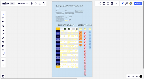
Notes from usability test using Miro
User research findings summary
Two types of goals for users of this dashboard were learning about the N3C project and visiting the page to find regularly updated content about the status of the project.
Within these two major use cases for using this dashboard, learning about the N3C project and visiting the page to find regular status project updates, there are several sub-goals that differ among different types of users.
One type of user that we want to focus on are scientists studying COVID-19 that might potentially sign up to utilize the N3C. The number of users engaged on the platform is a major metric how how successful the project is and so it's important to prominently display this information. These researchers often have particular topics that they're interested in, such as COVID-19 patients that also have a particular co-morbidity or a belong to a particular age group. Learning about the groups that N3C has set up that they can join and work that has been done that are focused around these particular topics in the N3C is important. There is a great deal of variation in the level of resources available to researchers who are potential users of the platform. Some include teams led by a primary investigator who might be a practicing clinician and is supported by others in specialized roles like statisticians and programmers; others are solo researchers, who might greatly benefit from resources that the N3C is able to provide, such as technical support and collaboration groups.
Learning about the data itself that N3C provides to researchers is also crucial for users being introduced to the platform. This includes learning about the amount of patient data available, what locations it is coming from around the United States, and what the demographic distributions of it are.
There are key pieces of information that some users like to regularly return to this page to keep up to date on. One of these is a list of data transfer agreements that medical institutions around the United States sign, allowing the N3C to add their data to the platform. Another is the list of publications that researchers using the N3C have produced, including research papers, pre-print articles, and conference presentations about treatments for COVID-19 and risk factors like co-morbidities. Stakeholders also use this page to find specific key performance indicator metrics, such as specific details from the patient like like number of medications prescribed or hospital visits included.

Personas and user journey map shared with team
Design Process
Assessing the current design
After performing initial usability tests, I began reviewing the current content on the dashboard page to identify potential usability issues with the current UI. I added these notes on a Figjam board that I shared with the team to invite feedback and collaboration. This board eventually grew into a shared space for people to collaborate and follow along with the design process.
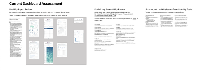
Current dashboard assessment section of Figjam board
At this stage, the team had not decided whether issues with the page would be addressed through updating and tweaking the current interface or by creating an entirely new design. I discussed these issues and possible ways of resolving them with leadership for the organization I used the information assessing the current dashboard I had gathered above, in addition to a review of the web analytics metrics for the page and a content analysis, to help facilitate this discussion. We eventually decided that rebuilding the page from the ground up would be the best approach. Additionally, the team determined priorities for the new interface. One of these was to prioritize the desktop view of the dashboard since more than 90% of visitors to the page were using this type of device.
During these discussions, I also identified other members of the organization who both regularly use the dashboard and frequently interact with users of the platform to interview.
I reached out to these other members of the organization and interviewed them, transcribed the conversations and made summary notes based around major themes that I was hearing. Next, I performed a competitive analysis of other COVID-19 dashboards to find design inspiration. I also reviewed personas and their underlying interview data that had previously been created for an initiative associated with N3C.
.png)
.png)
Slides from presentation I gave to the team on findings from interviews
Initial Designs
After finishing my preliminary user research and assessment of the current design, I began ideating. I wanted to make sure to start by exploring a wide range of design solutions. Creating pencil and paper sketches was my first step.

Preliminary pencil and paper sketches
When I shared these sketches with other members of the organization, they shared that they particularly liked (1) a compact view with key information above the fold on a desktop screen and (2) a more expansive view with a narrative element. With this information, I created wireframes in Figma to expand on two of these ideas from the sketches, a scrolling "tour view" and a compact landing page.
wirefram1.png)
Wireframes 1

Wireframes 2
After I shared these wireframes, I received positive feedback from stakeholders. They thought that this general approach to the organization of the content would be effective in helping users more easily access the information that they were interested in.
After further conversations with team members responsible for front-end implementation however, I learned that they were particularly limited at the time in terms of their bandwidth for development. They suggested trying to rework this design using as many of the existing components on the current dashboard as possible.
To respond to this information, I created several wireframes with alternative layouts. I took a step back in visual fidelity and used Invision Freehand to encourage myself to think more broadly.
Wireframes 3
I shared these Invision Freehand wireframes over the course of a couple of weeks with stakeholders, updating the designs based on feedback. When I was presenting the wireframes, I made sure to invite the team to edit the designs and make suggestions.
After this, my next step was to begin creating a high-fidelity, interactive prototype.
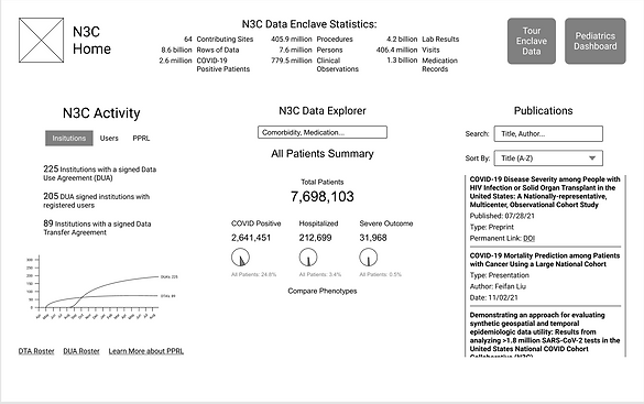
Administration View
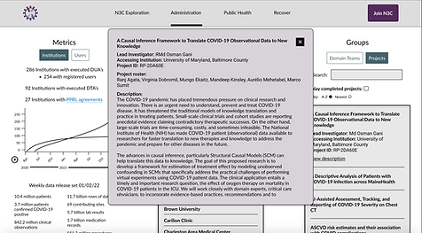
For the administration view, the three major pieces of content that I wanted to include were the list of institutions involved with N3C, key metrics, and groups.

Administration view desktop prototype

Administration view mobile prototype
One component on this view that I wanted to focus on improving from the previous design was the map visualization showing partnering institutions. This was a one of the most used components on the previous dashboard, but had significant usability flaws, such as its lack of zoom functionality and inability to display overlapping nodes where multiple hospitals contributing data to N3C are located in the same city.
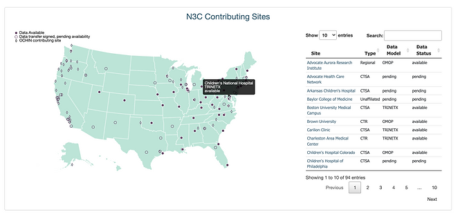
Previous Contributing Site View
I considered several geo-visualization strategies for handling this type of issue and decided to used a combination of a clustering effect and zoom so that users could both see the general spatial distribution of nodes and find the information.
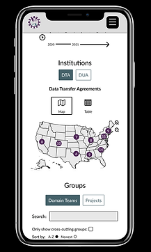
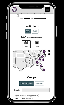

Institutions view
Two other components on this view that I wanted to improve from the previous dashboard were the project and domain team listings. The way that the listings had been laid out before used a simple table with content that spanned roughly 80% of the screen. This layout was an awkward for the content on larger screens and made the information difficult to scan and read, especially for project entries with long description sections.
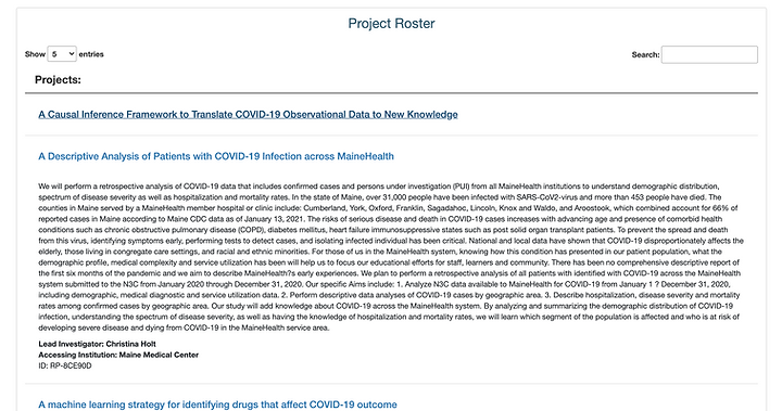
Previous projects section

Previous domain teams section
On the new view, I grouped these two sections into one column with a secondary button to toggle between them. I had learned from my interviews that these were related pieces of information. In the new view, it is easier to scan through the information. To design around the description fields of projects that are often very long, I created an overlay view that opens on click.
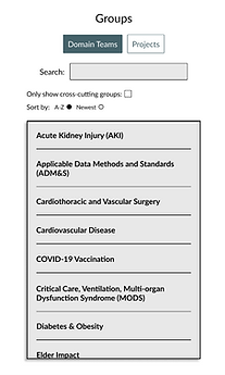
Groups content on prototype
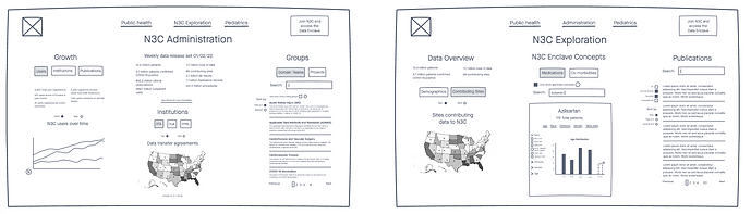
Exploration View
On the N3C Exploration page, I wanted provide the information that the tour view from my initial wireframes would would have while using a vertical layout that stakeholders had requested.

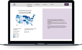

Exploration view on desktop
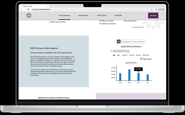
One of my biggest priorities on this Exploration page was providing a preview of the data available to researchers when they join the platform, including across demographic categories.
On the previous dashboard, data about patients, such as their demographics, their COVID-19 case severity, diseases they had, and medications they were taking were spread across several locations. When I interviewed users of this dashboard, they identified finding and using this information as a major pain point for themselves and for N3C users that they had talked to. Additionally, when I had previously given participants the task of finding the number of patients in the N3C data who have the disease diabetes (which could only be found on this dashboard page on the website), 4 out of 6 participants were unable to complete the task.

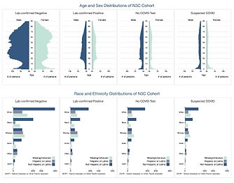
Demographics information on previous dashboard
Previously, our team had begun developing a tool called the Phenotype Explorer to help combine this demographic information into a single area. I provided a design for this feature, but it was shelved during production.


Phenotype Explorer Design
The tool that I designed for the final layout, the N3C Enclave Data Explorer, presents this information in a much more compact format than it was previously and is more prominently located on the dashboard. Users are able to see how the data is spread across several dimensions such as age, race, and gender. They're also able to view find specific counts using a hover-over or table view. They can also filter the data to find the counts and the distribution of patients from specific demographic cross sections, for example the the numbers of COVID-19 cases with different severity rating among hispanic females between the ages of 30-49.
Data Explorer 1
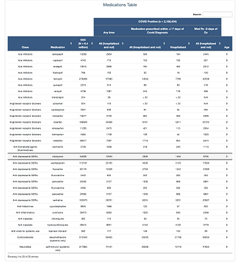
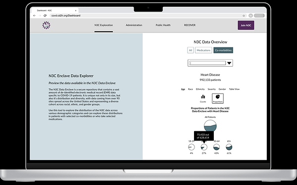
These counts and distributions could also be seen for groups of patients taking a range of medications or who are suffering from a co-morbidity. Users are able to search for medications and co-morbidities or browse a dropdown list of what is available within the N3C data. They can also compare the proportion of patients from these groups, such as patients with heart disease with the overall patient population in the data.
Design Evaluation and Developer Hand Off
After building these high-fidelity, interactive prototypes, I used them to conduct a round of usability testing with users of the N3C platform. I received mostly positive feedback, such as them finding the navigation structure intuitive. Using critiques that I heard, such as the proportions view in the N3C Data overview section being unintuitive and labels on the administration tab being unclear, I made updates to the UI.
My last step in the design process was to present this redesign project to N3C leadership and to receive final approval to move the designs into production. I presented this work in a 30 minute session and a 10 minute session to two groups of leadership across the project. In my presentations, I walked through the initial issues that prompted the redesign, the design process that I went through, and the final design.
Since receiving final approval for the design after these presentations, I have worked with the front-end development team to go over the designs in my Figma file for a handoff and to help create a list of development tasks.
Project Conclusion
Currently, the design for this project are still under development.
Evaluating the success of the product once it is live will be an important final step for this project. I will use both quantitative and qualitative measurements to do this evaluation.
Web analytics data will be a key quantitative measure that I will look at with the team. I will compare the bounce rate among first time visitors with the previous rate of 90% because (1) I heard from stakeholders that directing new users to the website is a top priority, (2) during usability testing, I found evidence that the high bounce rate could be caused by a significant usability issue where users were confused about navigating between this page and the rest of the website, and (3) I found that links directly to the dashboard from news sources like Time.com and MIT Tech Review were a major driver of traffic to our site.
I will also look into the number of users accessing the dashboard from different types of devices. Previously, the usage for the dashboard was dominated by desktop devices at around 90%, with mobile only at 6%. It was difficult to tell whether this was because of the underlying preferences of users when viewing this type of information or because of flaws in the mobile design of our interface; this subsequent data may be able to shed light on this question.
I plan to perform a round of usability testing once the final version of the page is live, which will give me good qualitative data to understand how users are responding to the website compared to the previous reactions that I had seen.
I'll also be seeking qualitative feedback from users within the organization that use the dashboard for administrative purposes and that are in regular contact with researchers using the platform as well as leadership within the organization. An example of feedback that I have already received came from a senior researcher at a college of medicine who reached out directly after I presented my work and said that he thought that the new design was "Very clean [...] I can find what I want more easily than the current website."
One way that this project has already been a success is by increasing awareness of UX methods within the organization. I made an effort throughout the project to explain parts of the UX design process that stakeholders were not familiar with, such as user research and iterative design. I also tried to gather as much feedback as I could throughout the different phases of the project both to make sure that I was on track with the goals of the organization and to help increase buy-in for design work and to provide direct exposure to what UX design is and why it is important.